Restyled Vintage Farmhouse Crocks DIY
Textured White Painted Crocks
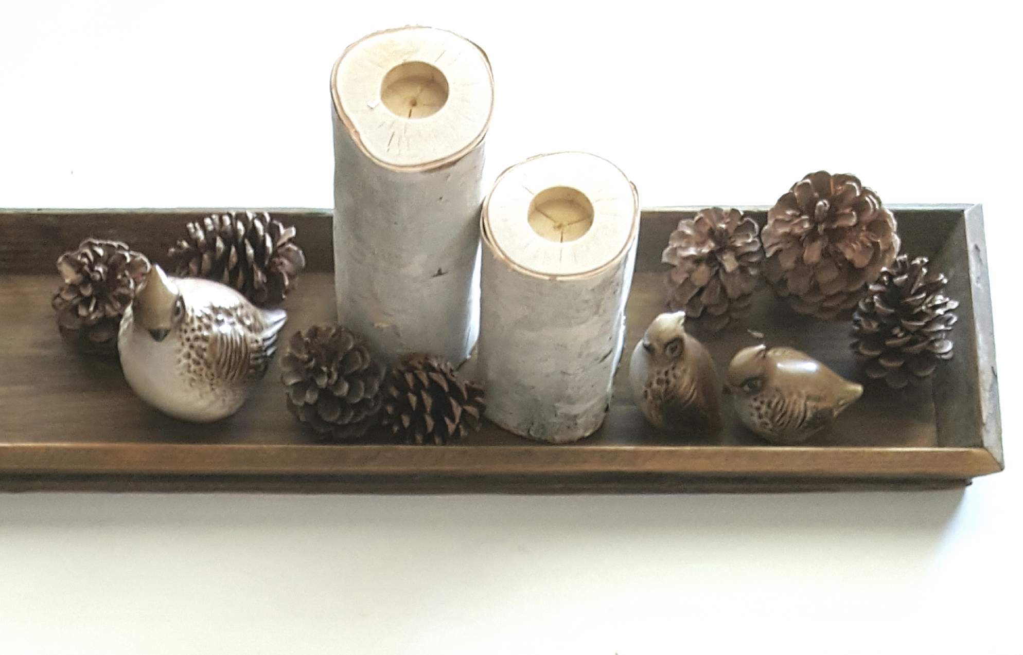
This Christmas salt and pepper set is available in my Etsy shop.
I turned a set of vintage farmhouse crocks into a set of chic white modern textured crocks and I luv, luv, luv them!!!!
Now before you get all upset with me because I ruined perfectly good vintage crocks, the set I thrifted was a miss matched set of 2nd's meaning it had flaws and they were not perfect.
One had a lower lip, some of the decorative striping was a mess and the lettering had a few problems. It was probably reproduced in the 70's or 80's when country décor was just becoming popular again. So they weren't antiques.
Are we good?
 |
| Before |
Vintage farmhouse style
After
Modern Chic Style
a reflection of my modern decorating style.
This is what you will need:
- Krylon Colormaster Flat White paint + primer spray paint- two or more cans depending on what you are spraying over,
- Rust-oleum Textured white/off white spray paint- I used less than one but buy extra if you want more texture.
Here is how I did it:
First I used a sanding block to lightly rough up the outside of each of the crocks and then wipe off the dirt and any dust off.
I then prepped the surfaces by using a little denatured alcohol on a rag to wipe down the outside and let it dry.
I wanted to be able to decorate with fresh flowers and greenery so I only painted the inside lip of the rim and left the glossy finish inside.
Next up the painting! It took 3 to 4 coats of the flat white to cover the crocks completely. When they were dry I started with the textured paint it only took a few coats to get it where I wanted it. I let it dry in between each coat of paint. The textured paint wasn't as white as I wanted so I finished the project by painting two more coats of the flat white.
I am so happy with my beautiful crocks...💙Blessings
Vintage finds, modern relics and handmade decor on Etsy... stop by and say hello!
Let me know what you think!